
I met Aaron Campbell at a networking event. He'd seen some of the websites we'd been building at Blessed Arc Media, and what caught his attention was how fast and clean they looked. No clutter, no lag — just sharp sites that loaded quickly and got straight to the point.
Aaron runs Camby Designs, a craft brand identity studio out of Olathe, Kansas. He's spent over a decade helping businesses build brand marks shaped by strategy — logo systems, color palettes, messaging, the whole identity. His work is thoughtful, detailed, and intentional. But when it came to the website he wasn't able to get the speed and customization that our custom websites are able to get.
So we got to work.
What Wasn't Working
Aaron had built his original site on Squarespace. And to be fair, Squarespace is solid for getting something up fast. But it was limiting him in ways that were starting to cost credibility.
The site was taking 10 to 15 seconds to load. There was no sitemap, which meant search engines were basically ignoring it. The design didn't feel polished or cohesive — it lacked the streamlined, professional look that Aaron's own brand work delivers for his clients.
Aaron could build a decent-looking page in Squarespace, but the technical side — performance, SEO structure, mobile optimization — wasn't something Squarespace made easy, and it wasn't his area of expertise. He needed someone to handle that so he could focus on what he does best: designing brands.
What Aaron Wanted
The goals were clear from the start. Aaron wanted a site that was significantly faster, looked more professional, and kept visitors engaged instead of bouncing within seconds. He wanted people to land on his site and immediately feel the quality of his work — the same way they'd feel it if they walked into his studio and saw his brand projects on the wall.
He also needed the technical foundation done right. A proper sitemap. Clean code. Fast load times. The kind of stuff visitors never notice, but Google absolutely does. If you're curious about what those technical basics look like and why they matter, we break it all down on our website guide page.

Why We Moved Off Squarespace
This is a question we get a lot, so it's worth addressing. Squarespace is a great tool for certain situations. Aaron even offers Squarespace website builds to his own clients as part of his service packages. But for what he wanted out of his own studio site, it wasn't the right fit.
The customization ceiling was too low. Aaron had a specific vision — bold typography, a warm but minimal color palette, smooth interactions, and a layout that let his portfolio work do the talking. Squarespace templates can only bend so far before things start feeling forced. And on the performance side, the platform adds a lot of overhead that makes it hard to get those lightning-fast load times.
We built the new site custom from the ground up, which gave us full control over every detail — from how the fonts render to how quickly the images load on a phone.
What We Built and Why It Looks the Way It Does
The design of cambydesigns.com is intentionally simple. That's not because we cut corners — it's because Aaron's brand philosophy is all about clarity and craft. No noise. No filler. Just strategy-driven identity work presented in a way that lets the quality speak for itself.
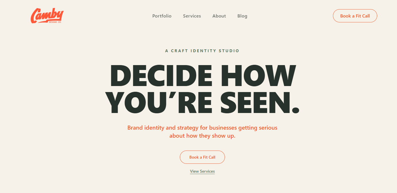
The homepage opens with a bold statement: "Decide how you're seen." That's not just a headline — it's the core of what Camby does for every client. We made sure the site's structure reinforced that message from top to bottom.
The color palette is warm and earthy — deep greens, soft creams, and burnt orange accents. That was a deliberate choice to match the handcrafted, personal feel of Aaron's work. This isn't a faceless agency. It's a studio run by a real person with a real point of view, and the design reflects that.
The typography is big and confident. We wanted the headings to hit hard and the body text to be easy to read on any device. No tiny fonts, no walls of text — just enough information to guide visitors through the story without overwhelming them.
The Reverse Dome Carousel
This one deserves its own section because it was by far the hardest piece to build — and the most rewarding.
On the homepage, there's a portfolio carousel that showcases Aaron's brand work. But it's not a standard flat slider. The cards are arranged in a reverse dome shape, giving depth and movement to the section as you scroll through the work. It feels smooth, almost physical, like flipping through cards on a table.
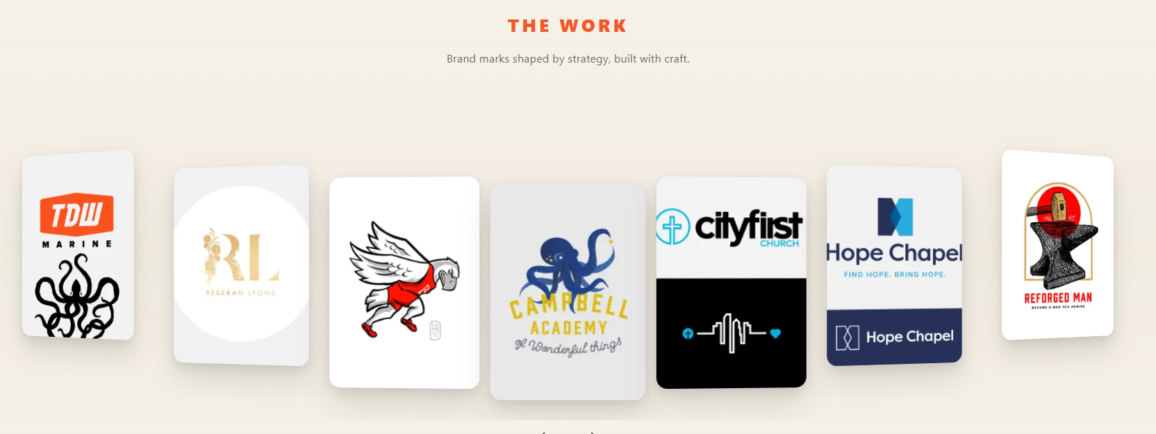
Getting this right took serious engineering. The math behind the curve, the smooth scroll behavior, the way each card scales and fades as it moves — all of it had to be dialed in precisely. But the payoff is worth it. It's one of those features that makes you stop and interact with the page instead of just scrolling past. And for a brand identity studio, that kind of engagement with the portfolio section is exactly what converts a visitor into a lead.
Speed That Actually Matters
Remember that 10 to 15 second load time on the old site? The new site loads in under 2 seconds.
That's not just a nice stat to brag about. A slow website is the fastest way to lose a potential client. Most people won't wait more than 3 seconds for a page to load, and Google has been using page speed as a ranking factor for years. When Aaron's old site was taking over 10 seconds, he was losing visitors before they ever saw a single logo he'd designed.
We optimized everything — image compression, clean code, efficient asset loading — so the site feels instant whether you're on a desktop or browsing on your phone over a cell connection.
The Full Site Structure
We built out a complete site structure that gives visitors a clear path no matter where they enter.
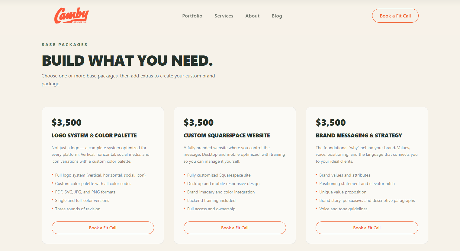
The homepage tells the brand story and showcases the work with that custom carousel. The portfolio page dives deeper into case studies — real projects like Oakhill Christian, Frank + Harvey, and City First Church — so potential clients can see the process and results, not just a logo on a white background. The services page breaks down exactly what Aaron offers with transparent pricing, which builds trust before the first conversation even happens. The about page introduces Aaron's background and philosophy. And the blog gives him a platform for sharing brand strategy insights over time.
Every page has a clear call to action: Book a Fit Call. That's Aaron's version of a discovery call, and we made sure it was easy to find on every single page without being pushy about it.
Two Weeks, Start to Finish
The entire project — from our first planning conversation to the finished live site — took two weeks.
That's not because we rushed it. It's because we had a clear scope, a client who knew what he wanted, and a process that doesn't waste time on unnecessary revisions or bloated timelines. Aaron was incredibly impressed with how quickly it came together and how smooth and fast the final product felt to browse through.
That's the kind of turnaround we aim for on every project. You can see more examples of what we build and how fast we deliver on our portfolio page.
What This Project Comes Down To
Aaron Campbell is someone who takes craft seriously. Every brand identity that comes out of Camby Designs is built with strategy, precision, and care. His website needed to reflect that same standard — and now it does.
If you're a business owner who's outgrown your current website — whether it's too slow, too generic, or just doesn't represent the level of work you're doing — that's exactly the kind of problem we solve. No templates, no page builders, no six-month timelines. Just a clean, fast, custom website built around your business.
Check out the finished site at cambydesigns.com, and when you're ready to talk about your own project, take a look at what we've built — then give us a call.